
Although we live in an age of unprecedented interconnectivity, the task of delivering successful presentations has remained a little lost in time. As meeting rooms become increasingly distributed and audiences can be instantly welcomed from anywhere in the world, the same rules still apply for all presenters: Keep things simple and engaging.
However, this can be easier said than done when it comes to sharing complex data across a company or to clients. Whether you’re presenting information on a Zoom call or sharing a report within your office meeting room, it’s essential that you take your audience into consideration as a priority and make sure that they reach the conclusions you’ve drawn with an engaging and informative chart.
There are many things that can get in the way of an impactful data-driven presentation, and many of them share the same pitfalls of traditional presenting. Perhaps the most significant issue stems from the presenter becoming too close to their content. This can lead to valuable contextual information being omitted from slides and leaving your audience in the dark.
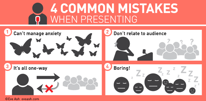
(Image: Eve Ash)
As we can see, there are many key presentation mistakes that can hurt the effectiveness of the data you present and it’s worth reiterating for presenters to keep in mind. Keep the audience involved wherever possible and ensure that the content relates directly to them. This means that you should ensure that your findings are applied directly to their department or areas of expertise. You also need to keep your audience involved and engaged wherever possible to ensure that they’re receptive to the information you’re sharing.
One of the most effective ways of ensuring that your data is presented and shared effectively is to incorporate it into infographics that are easy to digest. Although the prospect of getting to work in presenting your data can seem like a daunting level of added toil, it’s easy to build infographics with the right collection of tools to hand.
With this in mind, let’s explore how you can build impactful presentations that are powered by high-quality infographics:
Acknowledge the Importance of Audience Engagement
We’ve all been there. You’ve spent an inordinate amount of time sourcing data to draw well-formed insights into the topics that matter most to your business. The subsequent challenge of incorporating your data into a presentation that’s both informative and attractive enough to keep your audience glued to your screen can seem like an added time-sink when other tasks are looming.
However, making a successful presentation isn’t simply about making your slides look pretty–it’s about making your data both understandable and easy to consume.
Luckily, there are plenty of free and paid-for solutions that can help you to prepare infographics for presentations by offering pre-designed slides that are ready to work with your data to deliver an eye-catching presentation of valuable information.
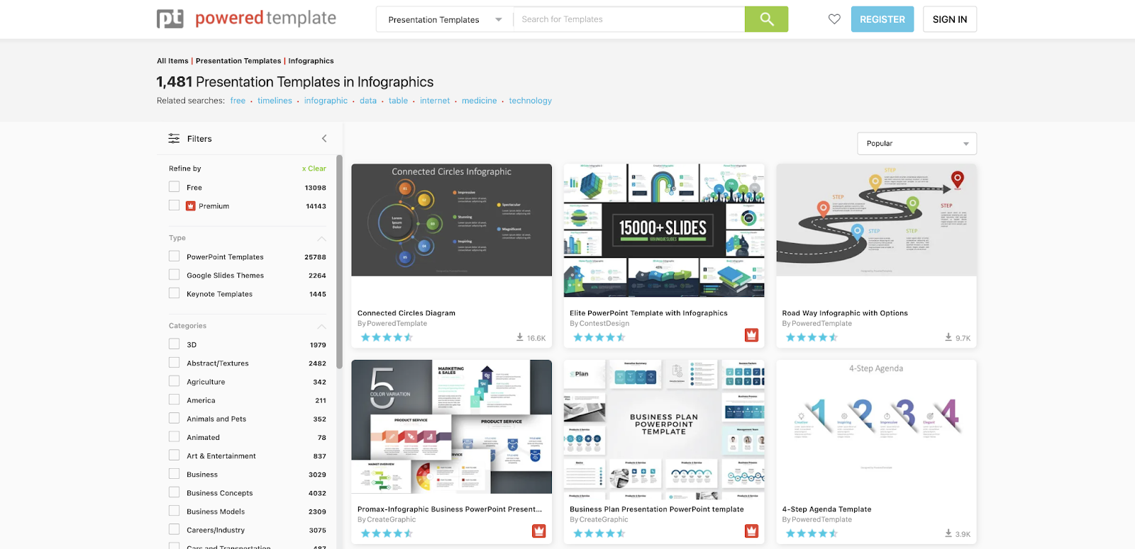
Platforms like Powered Template excel at offering users infographics that are ready for action and 100% editable and with thousands of options available, there’s every chance that you’ll discover the perfect templates to suit your data needs.
Learning how to Accommodate your Data
Although this part of the process is highly subjective, we can see how Powered Template can help presenters to find the right type of slide to suit their data needs.
Powered Template showcases a wide range of different slides and graphics that can be utilized for the presentation of data in infographics.
This variety can help you to accommodate your data in different ways and create new formats in which to share it with your audience.
Incorporating Infographics into your Presentation
Let’s take a deeper look at an example of Powered Template’s infographics. There are many free and paid for options when it comes to the platform’s library of content. Premium templates are signified by a red thumbnail in the bottom right corner of its preview depicting a crown.
Let’s say that we want to use the platform’s PESTLE Analysis slide. As we can see, this is a free template and even comes in the form of light or dark backgrounds for better variety. The user review function has given the slide a rating of 4.5 stars from 234 reviewers, and we can see that it’s compatible with both Microsoft PowerPoint and Google Slides.
Because it’s a free slide, the condition is that it has to be attributed to Powered Template somewhere within the content.
Once you select to download your template, a copy will appear within your chosen format. From here, you can edit and make changes as you would a typical slide–all with the design itself ready and raring to go.
Although it can be a tedious process sharing engaging data-driven content with an audience, platforms like Powered Template can make the creation of infographics simple by enlisting the help of professional designers to pick up the slack on your behalf.


0 Comments