Photoshop Elements 15 is essentially a basic and more accessible version of photoshop, which allows you to give any picture a quick touch-up. It also has 'expert' mode which gives you the layers and more commonly used commands in Photoshop. I've been using this to create a wide variety of promotional material, from business cards to posters, and it certainly does the job for me.
To make a basic graphics in photoshop, follow these simple steps and you'll eventually get there in no time.
1) Make sure that you're in the 'expert' mode of Photoshop. Click 'expert' in the top bar when you first open Photoshop Elements. Then create your document by opening up 'file' & then 'new'. A pop-up window should now appear in front of you.
Select your document type to 'international paper'. Then select which paper size you need (for a standard poster choose A4). A blank document should now appear.


2) You need to create a background by pressing Ctrl + Shift + N keys to create a new layer (we do this in case you make mistakes). A small box should pop up called 'new layer' - click OK on the box to continue.

You can now add any colour you want to make your poster stand out. To do this, go over to the colour boxes on the left-hand side, click it once & a colour spectrum box should pop up.
Choose your colour, click the OK button, & then select the paint bucket tool in the left-hand bar:


Click on your document to fill your background.
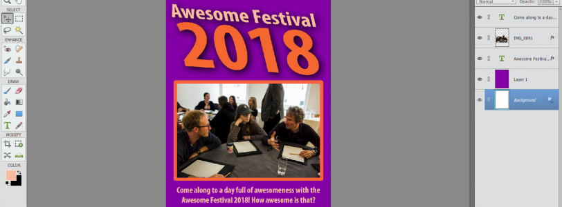
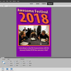
3) Add your text. For the best results, use a colour for your font that doesn't clash with the background colour (i.e. it hurts your eyes). Here's an example below:
As you can see, the colours make a big difference for you and your audience.


Tip: DO NOT USE COMIC SANS. It's an outdated font and makes your overall design look really cheap, plus the font will be the first thing a person sees before reading. Unless you use the font to promote stuff to children's nurseries and playgroups, it's best to steer clear of it. Use a font that is more modern, clearer and appealing to the target audience.
Now, here's the fun part. You can manipulate and change your font into something much more unique and interesting in Photoshop. For all you beginners, it's called the transform tool:

As seen in the picture, select the transform tool in the right-hand side (looks like an arrow with a cross-section), which should provide you with three different ways to 'transform' an image/text. Select one of those, click on one of the boxes on corners of the text and off you go.
4) Add images and shapes to boost your poster by going to the top-left corner to click 'file'.

Select 'place', and your File Explorer should pop-up:

Select an appropriate image to 'place' the image on your project:

I decided to tidy up the poster a bit to make it a bit more appropriate for the audience, which is what you need to keep in mind when designing other graphics. Make sure you know who you're designing for, rather than making a pretty poster and hoping for the best. You need to know what draws someone to a design, and how it draws them in.
That's it! These are the basics of making your own design for a poster for your event. Of course, you're not going to get to grips with Photoshop straight away. It will take a lot of time to learn and get used to. There are plenty of resources to use to get you there faster and soon you will be a master of design.


Through this post, the user can easily make their own poster using photoshop. It really helps the user to enhance their knowledge about photoshop. Still, anybody facing any type of issues then they can go through https://www.adobesupportphonenumber.com/